Service improvement for Acciona: Design consulting in a competitive market
The Brief
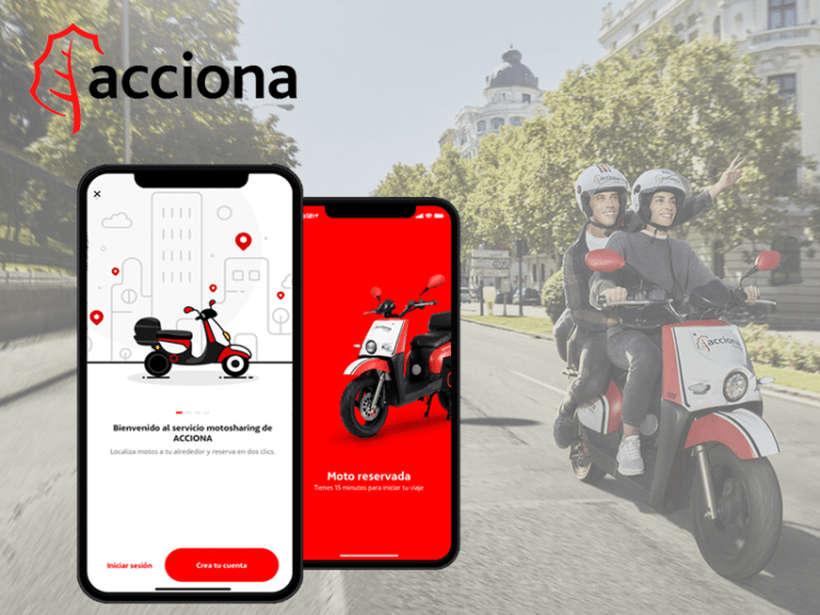
Spain has the fastest growing motosharing market in the world. Acciona, a Spanish conglomerate group dedicated to the development and management of infrastructure and renewable energy, has recently entered the fray after launching their new motosharing service. With many companies now vying for the top spot in Spain, Acciona has hired Alkemy, a digital innovation consultant, to help them improve their app/service in order to differentiate themselves from the competition.
Companies

.

My Role
UX Designer
Project Manager
Location
Madrid, Spain
The Research
Having little background knowledge of the industry, company, or service, we decided to start from zero and attack the research phase from three directions:
1. Market Research
Context
What is Motosharing? How does it Work? How popular is it in Spain? What is its history and what are possible future trends?
Company
Who is Acciona as a company? Why have they decided to enter the motosharing market? What are their values and how are they currently trying to achieve their objectives?
Competition
Who are the biggest competitors in the industry? How does their service/product compare to Acciona’s?
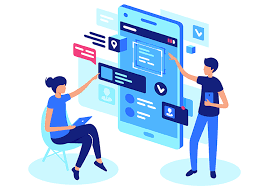
2. User Research
User Interviews
We designed a list of open-ended interview questions and took the streets to interview current and potential users. It was fairly easy to find them; we just had to look for the bikes!
Surveys
We also sent out a survey via our social networks in order to better understand what type of people use the service, why they use it, and what they value most from a motosharing company.
Ratings and Reviews
Lastly, we scoured the app store in order to better understand the users and their opinions of the company/service. We made a spreadsheet to be able to sort and filter the comments
3. Usability Testing
Shadowing and Guerrilla Usability Testing
Since we were consulting for an app that was already developed and released to market, it was fairly easy to go out and test it with end users. When possible, we shadowed them through the registration, reservation, and in a few cases, during the actual journey on the motorbike.
Heuristic Evaluation
In order to better understand possible problems with the current design, we conducted a heuristic evaluation. We produced a document examining overall usability based on Nielsen’s 10 heuristics.
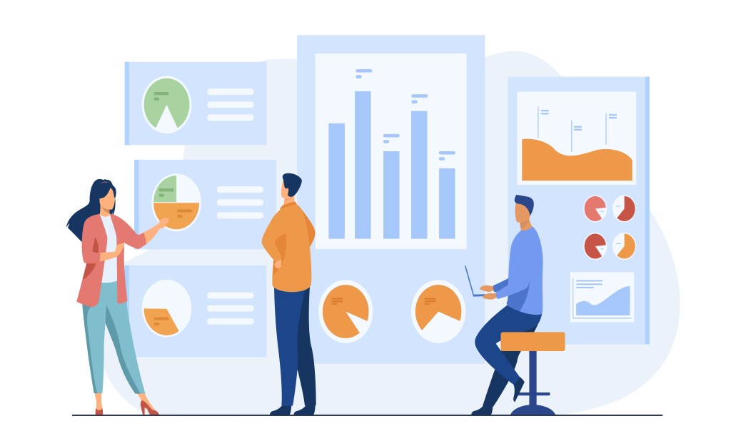
Analysis and Definition
With all of the information we collected in our research phase, we could begin to make sense of our findings. In order to better understand the user and their needs, we produced:
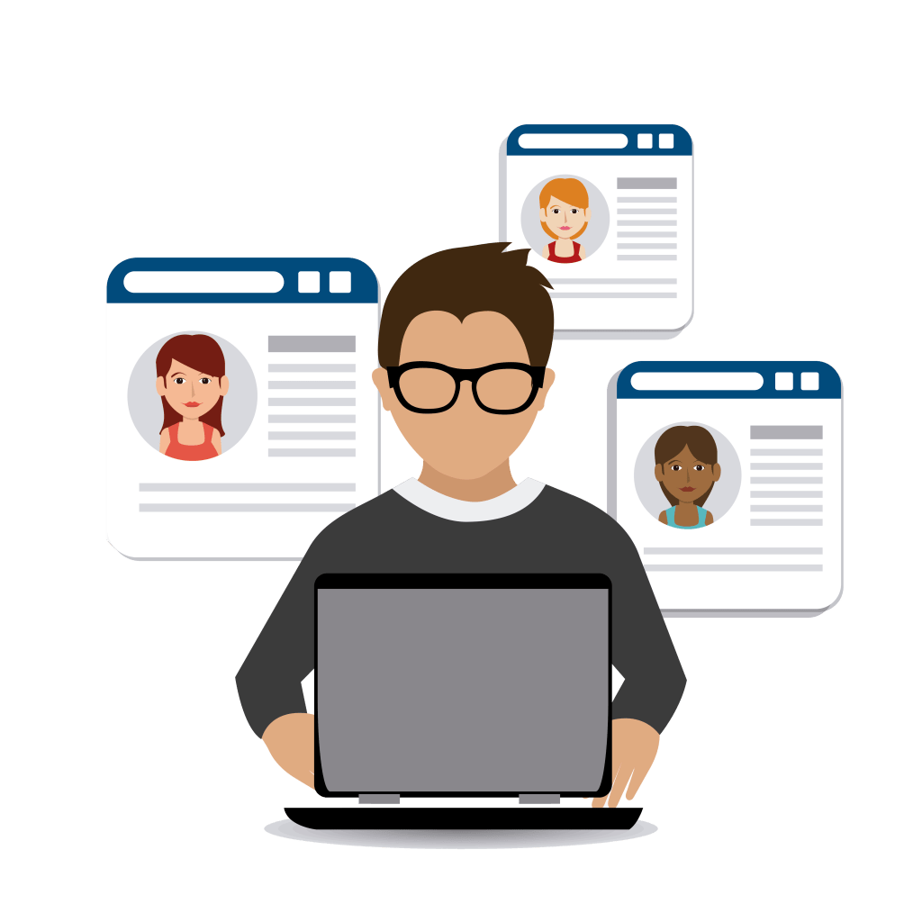
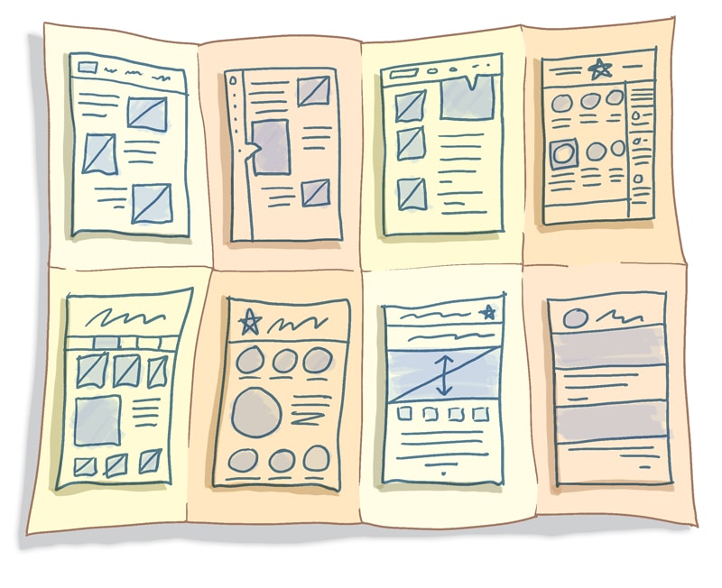
1. User Personas
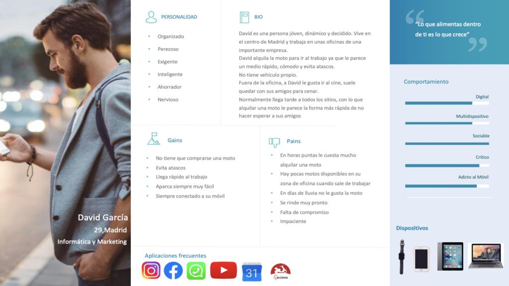
We discovered that the average user of this type of service is a 30 year old, urban-dwelling professional that does not have their own vehicle and often uses other modes of transportation such as bus, metro, etc. We made personas based on this profile and went on to define their pains and gains. In what way is the service currently helping them achieve their goals and in what ways is it failing them?
2. Customer Journey Map
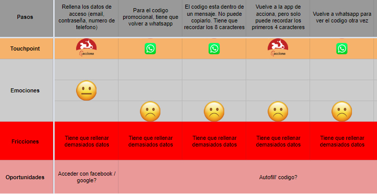
After our shadowing and interviews, we were able to construct a customer journey map. We made sure to pay specific attention to paint points that the user encounters with the current service. We found that we could essentially separate the journey into five phases:
- Registration
- Onboarding
- Searching and Reservation
- The Trip
- Finalization
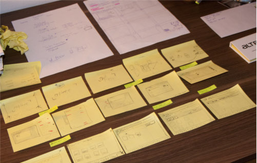
3. Affinity Diagram

One of the signs of a successful research phase is the accrual of mountains and mountains of information. But no fear, as designers we have learned to make post-it notes our best friends. We created an affinity diagram to better analyze and understand the problem.
The Problems
After organizing and analyzing our research findings, we were able to define some of the main problems for the users. Because we felt that it would be too costly to solve problems related to the actual trip and the motorbike itself, we decided to limit the scope to the first three phases. We figured this would allow us to produce design changes that would have a big impact at a relatively low cost. In the end, we defined the problems as follows:
1. Registration

Based on our research, we discovered that the majority of users first register for the service in the moment that they would like to hire one of the motorbikes. However, after our user research and usability testing, we discovered that the registration process is extremely frustrating and can take up to 24 hours. With the current system, many potential users are likely to quit before even hiring their first motorbike.
2. Onboarding

Roughly 3 of every 4 users said that they didn’t understand many of the essential features of the service (starting the motorbike, lifting the kickstand, changing the mode of conduction, etc.). There is currently a small pop-up with basic information immediately before the user starts the journey, but most users say that they simply close it without reading.
3. Searching

Not all of Acciona’s motorbikes are created equally. There are 3 different models with different maximum speeds. Some of their bikes have rain covers while others don’t. When it comes time to look for a bike, many users are currently frustrated at the difficulty of searching for a bike with their preferred features.
4. Reservation
Many users use the bikes to travel to and from work. However, users who work normal hours in large office buildings often find themselves engaged in a fierce race to reserve the motorbikes when it comes time to leave the office. They often have to stop working, open the app and reserve a bike before they even leave the office.
Ideation and Prototyping
After identifying the 4 problems that we wanted to address, we started holding ideation sessions. During these sessions, we always kept in mind some of the golden rules of ideation:
- There are no bad ideas
- Quantity over quality
- Write down everything
- Ideation doesn’t have to stop just because the session is over
In order to structure our sessions, we utilized some common UX tools and techniques:
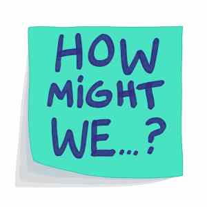
How Might We?
- How might we create a registration process that is quick, intuitive, and user-friendly?
- How might we help the user learn about the product and service before it comes time to take their first tip?
- How might we help the user to find specific types of motorbikes?
- How might we speed up the reservation process to allow people to reserve easily while they are at work, on the go, etc?
Worst Possible Idea

We brainstormed the worst possible solution to each problem. Ideas ranged from sending a personal assistant who helps you every step of the way while insulting your intelligence to having to take a 3 day course before being able to use the service. In the end, this type of exercise doesn’t directly produce design ideas but it helps get the creativity flowing. And if we know what solutions absolutely won’t work, maybe it can help us think about which ones will.
Crazy Eights
For each ‘how might we’ question, everyone on the team sketched eight quick ideas. After eight minutes, each person presented their ideas to the rest of the team. We then voted for our favorites. We continued with each person’s top three ideas based on the votes.
Storyboarding
After the crazy eights activity, we set out to create storyboards for all the solutions. What would that solution look like if we played it out entirely? Would it relieve any of the user’s pain points? What else would we need to include in order to solve the problems?
After voting on solutions and developing storyboards, we began to create the prototypes. In general, we designed in three phases:
Sketching

Based on the storyboards, we started to sketch the most important screens in each of the processes. We then met to discuss and make changes.
Wireframing

Once we were more or less done sketching the basic flow of the process, we created some wireframes using sketch and figma. We tested them within the team in order to make changes and see if we were ready for higher fidelity prototype.s
Interactive Prototyping
Because the app wass already developed and in use, we were able to use current designs to quickly create fairly high fidelity, interactive prototypes.
The Prototypes
In the end, we developed prototypes for the 4 new designs/functionalities that we feel addressed the problems that we had defined earlier in the process
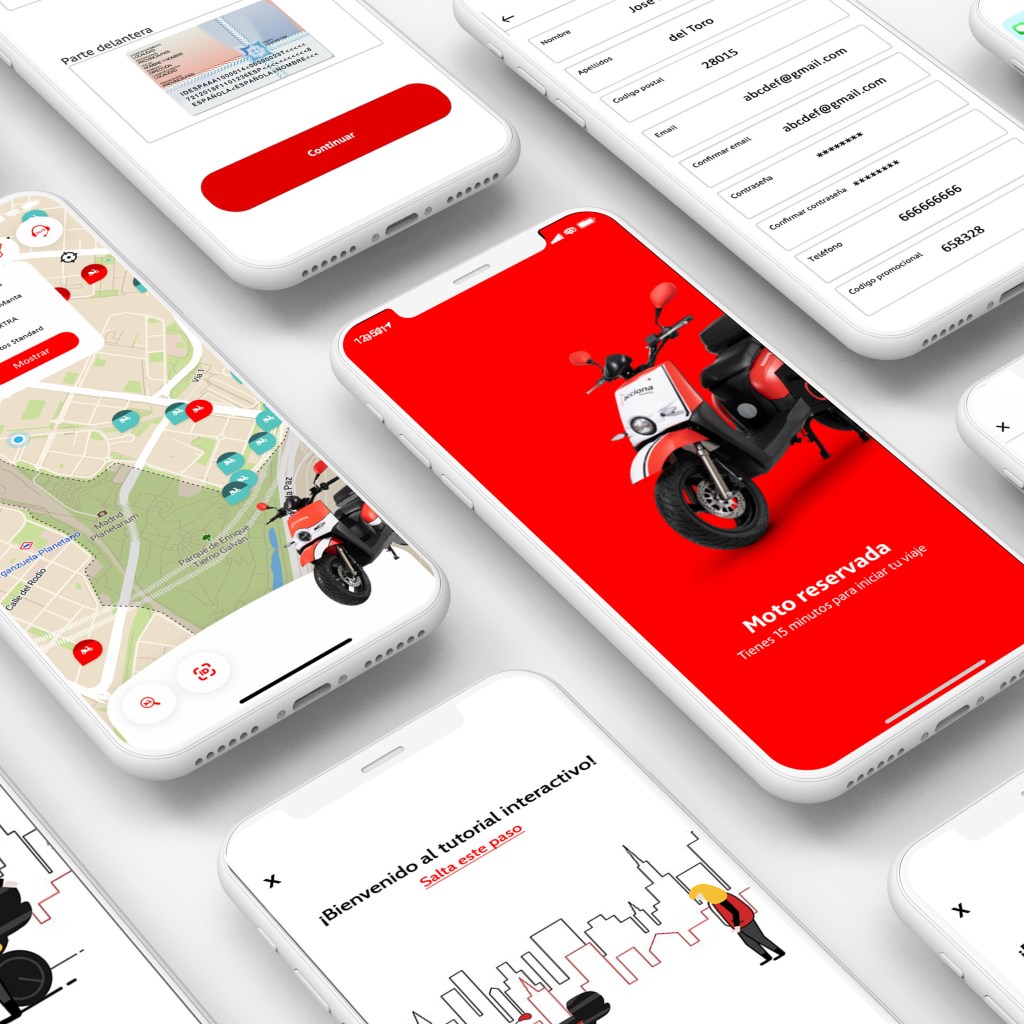
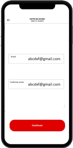
1. Registration
Problem
Long complicated, frustrating registration process
Solution
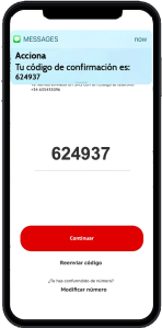
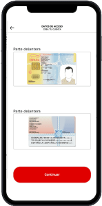
A simple, quick, intuitive process that utilizes:
- Minimalist screens to guide you through each step
- Instant phone number verification and autofill confirmation code
- Attached system for instant document validation
- The possibility to attach software to read identification documents in order to extract personal details and auto-fill account information
2. Onboarding
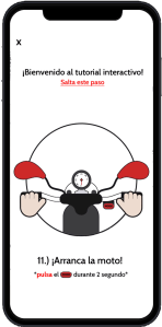
Problem
Lack of information about the process, service, motorbikes, equipment
Solution
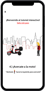
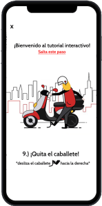
An interactive tutorial that includes:
- Simple, minimalist screens
- Gamification of onboarding process
- Possible rewards for completing
- “Learn by doing” design
- Steps that represent the real service
3. Searching

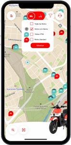
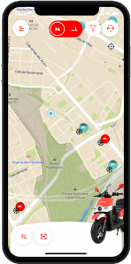
Problem
Difficulty locating preferred types of bike
Solution
A simple filter process:
- A standard filter button at top of screen
- Ability to filter by bike type, cold whether features, current battery charge. etc.
- Only show preferred motorbikes
- Save search settings
4. Reservation
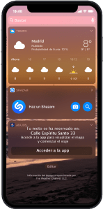

Problem
Need for faster reserving methods that can be used while at work, on the go, etc.
Solution
Simple, quick additions to the reservation process that can be used without opening the app
- Voice reservation system
- Reservation of closest bike
- Instant confirmations to mobile home screen
- Save shortcuts to mobile home screen
Testing and Validation
Now that we had a working prototype, we were ready to test. We formulated our hypotheses and the methods for validating them. Since we had 4 major design changes, we had 4 parts to the testing:
1. Registration

Hypothesis
That our new registration process was faster, easier, and more intuitive
Validation Method
From our initial usability testing, we knew more or less how long the old process took and how the users viewed it. In our testing, we measured the duration of our new process, observed the users, and closed with some questions
Results
With our new design and document verification process, we were able to cut the registration process down from 24 hours to less than 10 minutes. However, we realize that users were a bit lost during parts of the process. They didn’t know exactly which stage of the process they were currently on at any given time.
Future Design Steps
Add breadcrumbs to registration process to let user know exactly where they are and auto-save progress in case they are interrupted.
2. Onboarding
Hypothesis
That the users would want to do the tutorial and that it would be helpful.
Validation Method
After registration, we presented them with the option to do the tutorial. We kept track of the percentage of test users who selected to do the tutorial. If they chose to do it, we asked them questions about the details of the service afterwards.
Results
Only about half of the test users selected to view the tutorial. The ones that did, understood much better how the service and the motorbikes worked.
Future Design Steps
- Analyze whether or not it’s beneficial to give rewards for doing the tutorial. If we find that doing the tutorial can reduce the number of calls to customer support, it could be worth giving the users free motosharing minutes upon completion in order to encourage them to complete the tutorial.
- For the tutorial itself, increase the size of the instructions and test for clarity.
3. Searching
Hypothesis
That the users would want to use the new filters and that the filtering process would be simple and intuitive.
Validation Method
We informed the users of the new filter feature and gave them different tasks involving searching for different types of motorbikes. We measured the time and observed their work process.
Results
The new filter worked for the most part, but without a legend, users weren’t quite sure what each icon meant.
Future Design Steps
Find a way to communicate the meaning of each icon within the filter feature (types of motos, winter gear, etc.)
4. Reservation

Hypothesis
That our new easy-reservation features would be intuitive and usable.
Validation Method
We informed the users about the voice and shortcut features and gave them the task of reserving a motorbike without opening the app. We observed their work process and asked them questions afterwards.
Results
It was easy to reserve the closest motorbike using the new features. But after testing, we realized that the closest bike is not necessarily the best option. Some mentioned that they would prefer to walk a bit farther if the bike was in the same direction as their planned destination.
Future Design Steps
Explore the possibility of pairing the service with google maps in order to automatically reserve the closest motorbike in the appropriate direction.
Reflections
Value for the client

More Users
With easier and faster registration, Acciona would be able to increase the total number of users. Customers would no longer abandon the service before starting.
Fewer Customer Issues
With a more effective onboarding process, Acciona would likely be able to reduce the number of customer service calls and messages.

Increased Loyalty
Improved search and reserve features could set Acciona apart from the competition and help increase customer loyalty
Personal Learnings
1. Market Competition
Out of all the projects and consulting work that I’ve done, I’ve never had to focus so much on the competition. Working with huge companies like Renfe and Rio Tinto, of course there was some competition, but it wasn’t so relevant to our specific projects.
With Acciona, we had to think specifically about what design changes would attract and retain more customers. How could they differentiate themselves while offering a very similar service to the other companies? This is ultimately the question that made us focus on faster registration, gamification of the onboarding process, and quick reservations by voice.
2. The Future of Voice Design
We touched on it a bit in this project, but I honestly believe that within the next 10-15 years, UX design could become more focused on voice interactions than visual ones. We need to stop only thinking about designing screens and start to consider voice and other, more futuristic, types of interactions.
