A case Study in UX Design Consulting within a competitive market
The Context
The Brief


Spain has the fastest growing motosharing market in the world. Acciona, a Spanish conglomerate group dedicated to the development and management of infrastructure and renewable energy, has recently entered the fray after launching their new motosharing service. With many companies now vying for the top spot in Spain, Acciona has hired Alkemy, a digital innovation consultant, to help them improve their app/service in order to differentiate themselves from the competition.
My Role
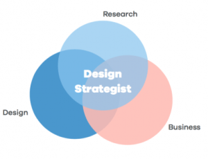
Working as a freelance UX designer for Alkemy, I was tasked with leading a group of 3 designers to carry out this consulting project. As the other 2 designers were specialized in the visual and UI aspects of design, I served more as a design strategist /ux project manager. In the end, I was responsible for planning the project phases, leading the research, organizing the insights, and making sure that we met all of the project deadlines.
The Research
Desktop Research
The Market
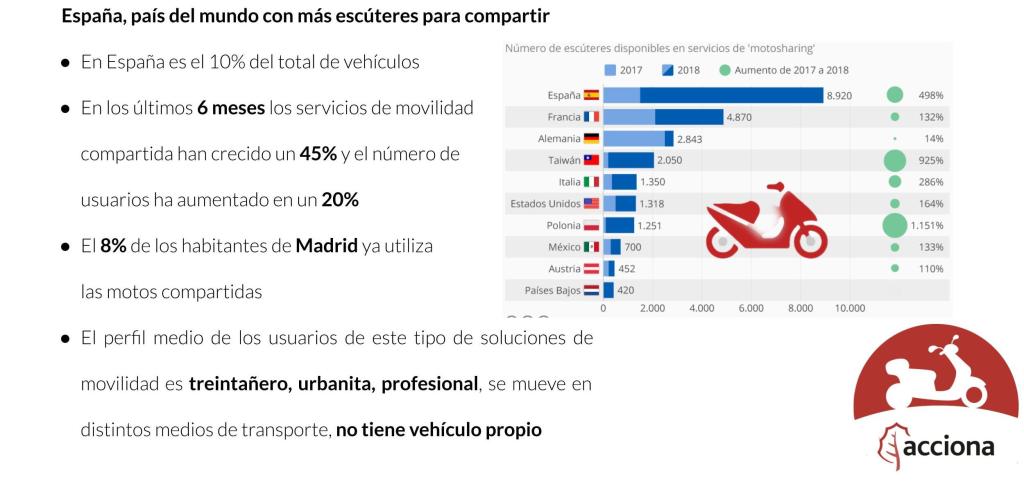
We started with an in-depth study into the motosharing market. We asked ourselves: What is Motosharing? How does it Work? Who uses it? How popular is it in Spain? What is its history and what are possible future trends?
Benchmarking
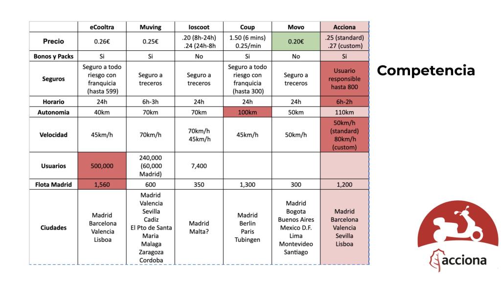
After establishing a basic understanding of the market, we researched the main competitors and did a benchmarking analysis. We asked ourselves: Who are the biggest competitors in the industry? How does their service compare to Acciona’s?
USer Reviews
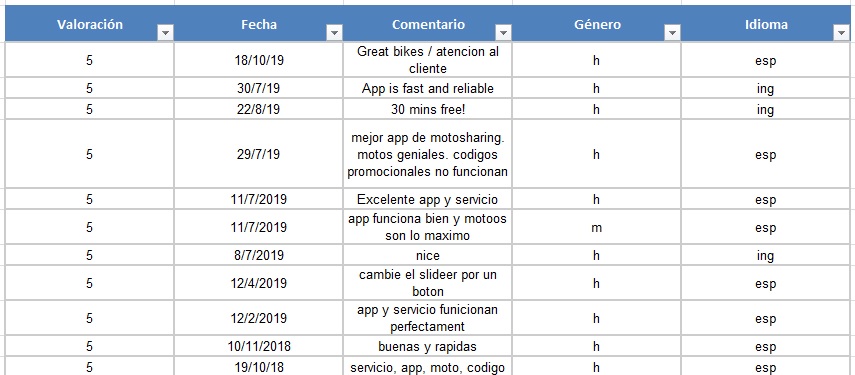
We scoured the app store in order to better understand the users and their opinions of the company/service. We made a spreadsheet to be able to sort and filter the comments
USer Surveys
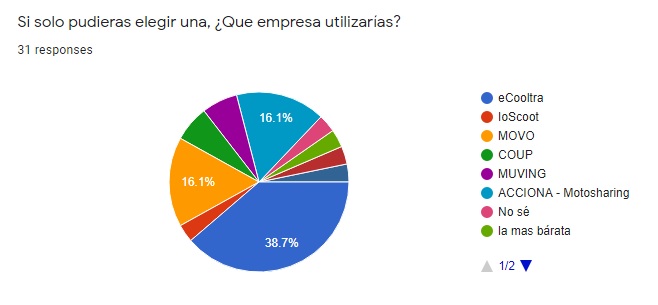
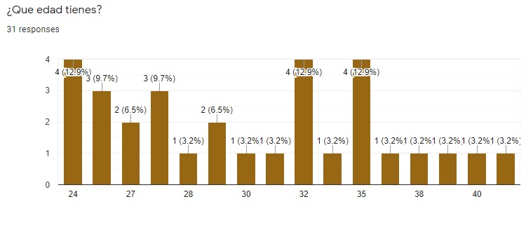
In order to better understand the users, we created a survey using google forms and shared it throughout our networks. The results gave us important initial insights such as age, frequency, reason for use, company preference, etc.
Field Research
Usability Testing and Interviews
According to the world-renowned Nielsen Norman Group, a sample size of 5 users is typically enough to identify usability problems. Just to be safe, we carried out guerrilla usability testing with 6 users. We observed them as they reserved a moto and we shadowed them throughout the whole experience, asking questions along the way.
When we were finished, we followed up with a list of open-ended questions. Based on things we had observed, we probed the users minds’ to see if we could gather any insights.
Potential User Interviews

Acciona’s goals were not only to improve the User Experience for current users, but also to expand their user base. Therefore, in order to gain additional insights into how to attract more customers, we also interviewed 6 non-users. These were people who fit the target demographics (age, location, lifestyle, etc.) but were not currently registered to use the service.
We asked them open-ended questions to try to discover the reasons why they weren’t currency using the service and to also find out what might motivate them to register.
The Analysis
Our USers
User Persona

We discovered that the average user of this type of service is a 30 year old, urban-dwelling professional that does not have their own vehicle and often uses other modes of transportation such as bus, metro, etc. We made personas based on this profile and went on to define their pains and gains. In what way is the service currently helping them achieve their goals and in what ways is it failing them?
Customer Journey Map
After our shadowing and interviews, we were able to construct a customer journey map. We made sure to pay specific attention to paint points that the user encounters with the current service. From there, we were able to identify some opportunities for improvement.
Problem Insights
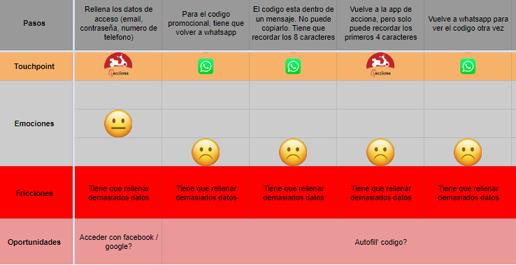
1. Registration

Easy Registration = Loyalty
The first thing we discovered about the registration process was that users had little patience. If it took too long, many users would simply quit and look for another app. On the other hand, if a user was already registered with one company, that’s usually the one they preferred. In fact, when asked about company preference, the majority of users said that they preferred the first company with whom they registered.
This was a very important discovery because it meant that users were most demanding during the registration process. Once they were registered, they were much more willing to tolerate a certain level of bad experiences simply because they had already invested their time with this company and didn’t want to go through the whole process again with another company.
From this insight, we knew that we had to focus on making the registration process as quick and simple as possible. Not only would this eliminate current frustrations related to Acciona’s long, complicated registration process, but it would also help to capture more loyal users.
2. Onboarding

Lack of understanding causes downstream Paint Points
Roughly 3 of every 4 users said that they didn’t understand many of the essential features of the service (starting the motorbike, lifting the kickstand, changing the mode of conduction, etc.). There is currently a small pop-up with basic information immediately before the user starts the journey, but most users say that they simply close it without reading.
If we could somehow create an effective onboarding session, it could help improve the downstream user experience. Not only that, but a better understanding of the service could significantly reduce the current workload of the customer support department
3. Searching

Not all motos are created equally
In Acciona’s fleet, there are 3 different models with different maximum speeds. Furthermore, some of their bikes have rain covers while others don’t. When it comes time to look for a bike, many users are currently frustrated at the difficulty of searching for a bike with their preferred features.
While some of their main competitors have filtering options within their app, Acciona has none. To stay competitive, it could be very important to be able to filter/search for specific motos.
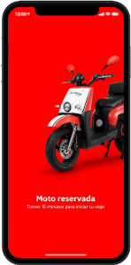
4. Reservations
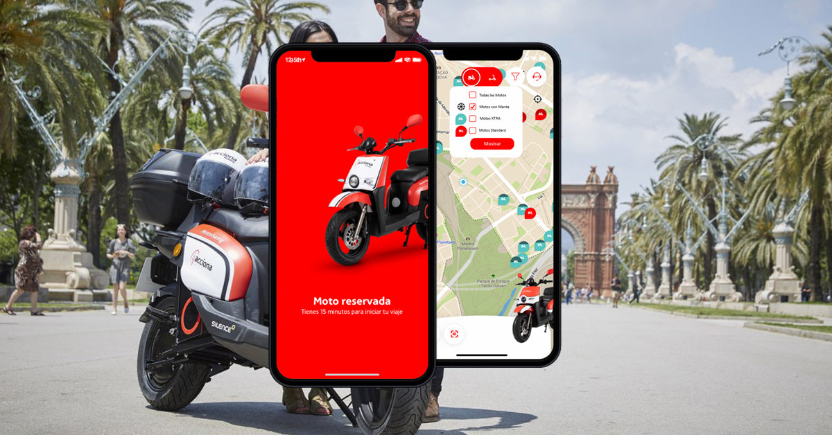
The Early Bird Gets the worm
Many users utilize the motos in order to travel to and from work. However, we discovered that users who work normal hours in large office buildings often find themselves engaged in a fierce race to reserve the motorbikes when it comes time to leave the office. They often have to stop working, open the app and reserve a moto before they even leave the office. Furthermore, after 15 minutes, the reservation is automatically canceled. If a user reserves prematurely and then has to unexpectedly spend extra time at the office, their reservation will be canceled.
This entire situation seems to be a huge source of stress for many users. If we can solve this, we can greatly improve the overall user experience for these types of users.
The Solutions
As a design strategist, I feel that it’s absolutely essential to match any proposed solutions to the specific problems that were found during the research and analysis phases. So in the end, we developed a prototype with 4 new designs/functionalities that we feel specifically addressed each of the 4 problems defined above.
1. REGISTRATION
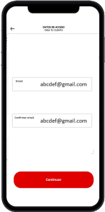
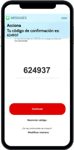
The Problem
Long, complicated, frustrating registration process that causes users to quit before we get a chance to prove the value of the service
The Solution
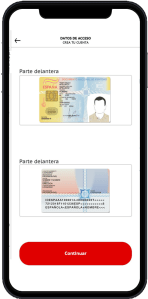
A simple, quick, intuitive process that utilizes:
– Minimalist screens to guide you through each step
– Instant phone number verification and autofill confirmation code
– 3rd-Party system for instant document validation
– Auto-read of ID in order to extract personal details and auto-fill account information
2. onboarding
The Problem
Lack of information about the process, service, motorbikes, equipment. This causes many problems downstream.
The Solution
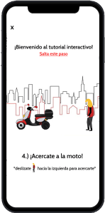
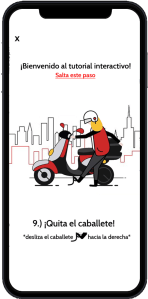
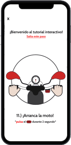
An interactive tutorial that includes:
– Simple, minimalist screens
– “Learn by doing” design
– Steps that correspond to the real-world service
– Gamification of onboarding process
– Possible rewards for completing
3. searching
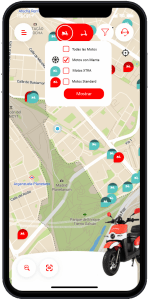
The Problem
Difficulty locating preferred types of bike. Not up to par with market competitors when it comes to searching and filtering
The Solution
A simple filter process:
– A standard filter button at top of screen
– Ability to filter by type, features, battery charge. etc.
– Only shows preferred motorbikes
– Save search settings
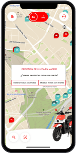
4. Reservations
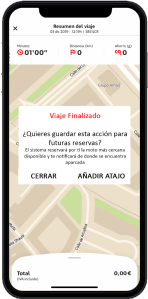
The Problem
Need for faster reserving methods that can be used while at work, on the go, etc.
The Solution
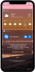
Simple, quick additions to the reservation process that can be used without opening the app:
– Voice reservation system that reserves closest bike
– Instant confirmation notification to mobile home screen
– Save shortcut to mobile home screen for future quick-reservation
Testing and Validation
In order to validate our 4 design solutions, we carried out a new round of usability testing and user interviews. We tested our prototype with 5 users and followed up with a brief interview using open-ended questions.
1. Registration
Hypothesis
That our new registration process would be faster, easier, and more intuitive
Validation Method
From our initial usability testing, we knew on average how long the old process took and how the users felt about it. We tested again with the 5 users, measured the duration of our new process, and followed up with a brief interview.
Results
With our new design and document verification process, we were able to cut the registration process down from 24 hours to less than 5 minutes.
2. onboarding
Hypothesis
That the users would want to do the tutorial and that it would be helpful downstream
Validation Method
After registration, we presented users with the option to do the tutorial. We kept track of the number of test users who selected to do the tutorial. If they chose to do it, we asked them questions about the details of the service afterwards to check their understanding. If not, we asked questions about why not.
Results
Only 3 of 5 test users selected to view the tutorial. The ones that did, understood much better how the service and the motorbikes worked. Future research is needed to explore methods for incentivizing users to do the tutorial.
3. Searching
Hypothesis
That the users would want to use the new filters and that the filtering process would be simple and intuitive.
Validation Method
We informed the users of the new filter feature and gave them different tasks involving searching for different types of motorbikes. We measured the time and observed their work process.
Results
With the new filter, users were easily able to search for motos with specific features. One user commented about the lack of information about the icons. Future iterations of the design will need to address the best ways to communicate the meaning of each icon.
4. Reservations
Hypothesis
That our new easy-reservation features would be intuitive and usable, and that it would significantly reduce the time it takes to reserve a moto.
Validation Method
We informed the users about the voice and shortcut features and gave them the task of reserving a motorbike without opening the app. We observed their work process and asked them questions afterwards.
Results
With the new feature, users could reserve the closest motorbike in less than 10 seconds, without even opening the app. However, one user commented that the closest bike is not necessarily always the best option. Some mentioned that they would prefer to walk a bit farther if the bike was in the same direction as their planned destination. Future iterations should explore the idea of reserving in a certain direction (i.e. “reserve the closest bike on the way to calle barcelona 32”)
Reflections
Personal Learnings
DESIGNING in a competitive Market
Out of all the projects and consulting work that I’ve done, I’ve never had to focus so much on the competition. Working with huge companies like Renfe and Rio Tinto, of course there was some competition, but it wasn’t so relevant to our specific projects.
With Acciona, we had to think specifically about what design changes would attract and retain more customers. How could they differentiate themselves while offering a very similar service to the other companies? This is ultimately the question that made us focus on faster registration, gamification of the onboarding process, and quick reservations by voice.
THE FUTURE OF VOICE DESIGN
We touched on it a bit in this project, but I honestly believe that within the next 10-15 years, UX design could become more focused on voice interactions than visual ones. We need to stop only thinking about designing screens and start to consider voice and other, more futuristic, types of interactions.
